Did you know that someone visiting your site will leave in less than 15 seconds if they’re not feeling connected?
Yep- it’s true! And that’s on a universal level. But imagine what it might be like for folks from marginalized communities to land on your homepage and not see themselves represented anywhere. Chances are, they’ll definitely be hitting that back button.
Just take a sec and imagine this. You’re a queer, non-binary white person, and your husband, who also identifies as queer, is Latinx. You’re planning a super secret date for your anniversary. (Let’s pretend this is pre-covid times.) You have the perfect idea. A couple’s massage class!
So you start looking around, and soon you start feeling kinda uncomfortable… like maybe the couple’s massage class was a bad idea.
Why would you start doubting yourself though? You were so excited about finding a class to take!
Well, chances are it probably has something to do with what you saw when you were looking for a good class. Every site you went to had pictures of thin, straight, conventionally attractive, white couples. Maybe you let that slide. It’s to be expected, right? So you keep looking at their services, and see that the only couples classes offered are “his and hers”.
Leaves you in a tough situation, doesn’t it? Do you decide to go along with it, and hope that nobody cares about the fact that you’re definitely not the straight couple that the instructor was expecting to see? Or do you forego your super secret date idea and find another one?
People shouldn’t have to make those choices, but it’s something that folks who live with a marginalized identity deal with everyday. I’m sure some of you have experienced this before. And for those of you that haven’t let me describe it.
It’s annoying. It’s tiring. It’s exclusionary. And, most importantly, it’s completely avoidable.
So that’s where you, the fabulous inclusive biz owner that you are, come in! You have the power to completely change those uncomfortable and exclusionary situations. And revamping your website’s homepage is the perfect place to start. Your homepage is one of the first things someone sees when they find your business.
And if they don’t feel seen by you, they probably won’t come back.
So, let’s make sure that doesn’t happen! Everyone who goes to your site should know that you see them. They should feel welcomed, accepted, and celebrated as soon as they get to your homepage.
Are you ready to make your homepage more inclusive? These ideas will help you get started!
Use Inclusive Stock Photos
There’s nothing worse than getting to a site and not seeing anybody that looks like you. Do your part to make sure that doesn’t happen
when someone goes to your website. Start replacing your stock photos with ones that represent folks from a variety of races, ages, abilities, body sizes, etc. (The list could go on forever.) My blog on inclusive stock photos has some good resources to steer you in the right direction!
And if you need a little inspiration, check out a sales page I designed for one of my clients, Self Care for Diabetes.
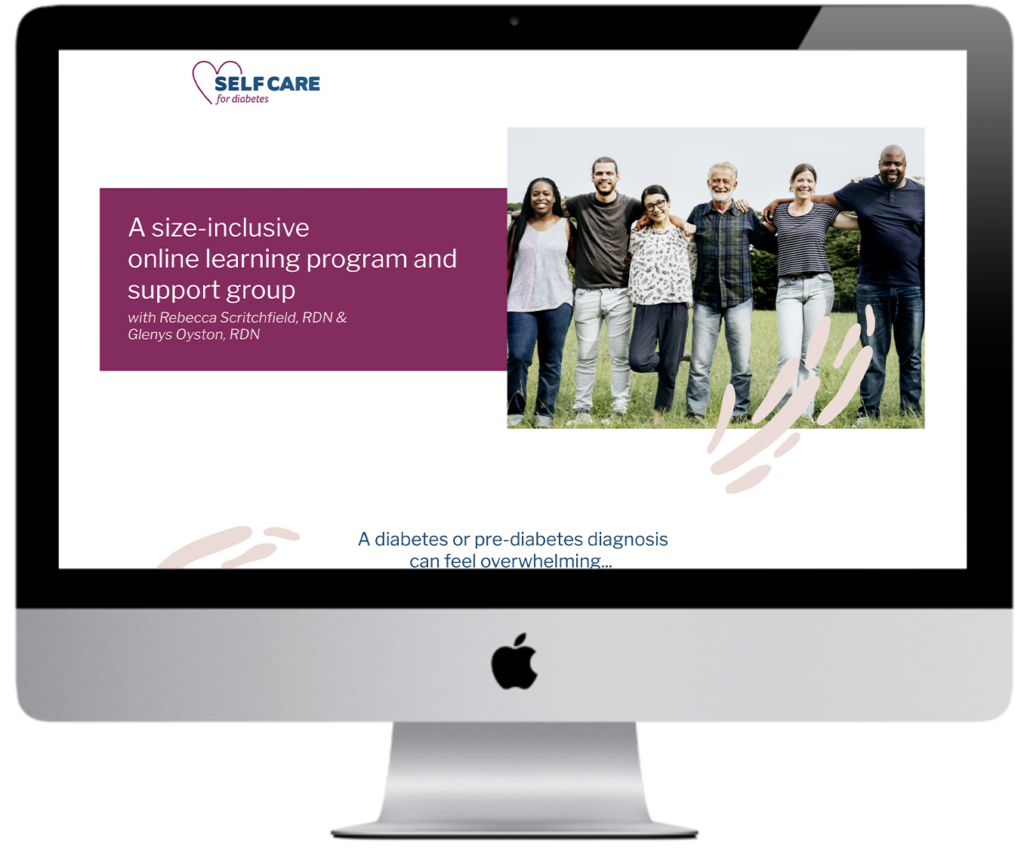
I knew that having a diverse set of folks in the stock photos for this project was a priority. Without the right stock photos, the sales page wouldn’t resonate with the diverse audience that my clients wanted to reach.
As soon as you get to the page, you see people of different ages, races, and body sizes. Their prospective clients are able to see that they work with individuals who look like them. It creates a sense of belonging which isn’t always found elsewhere.
Now, don’t get me wrong. Finding the perfect stock photo can sometimes feel like finding a needle in a haystack. But believe me, it’s worth the extra effort to make your audience feel included. That’s what us inclusive biz owners are all about, right?
Use Inclusive Language
Let’s bring things back to my example of a queer person looking for a couple’s massage class. The word choice used on sites was a big part of why they didn’t feel like they belonged at any of the classes. Sure, none of the websites used any negative language to make them unsafe or unwelcomed as a queer couple. Instead, their exclusionary messaging (intentional or not) came across with the things that weren’t said.
This is something that isn’t always super easy to see for folks who aren’t a part of any marginalized communities. But it’s something that’s hard to ignore if you’re part of the group being excluded.
I think the best way to see inclusive language in action is by looking at an example. Rebirth Garments is a clothing store that hits the nail on the head.
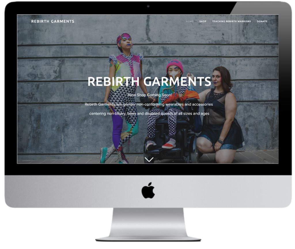
The second you get to their page, you can instantly see what their company is all about. Their hero makes things pretty clear. “Rebirth Garments are gender non-conforming wearables and accessories centering non-binary, trans and disabled queers of all sizes and ages.” They cut to the chase, and folks who are typically marginalized aren’t left wondering whether or not Rebirth Garments is a good fit for them.
Even if your biz isn’t that niched, your word choice can still have a huge impact on how your audience sees your brand. Make sure you’re not making assumptions about anyone’s gender identity, sexual orientation, physical ability, religion, etc. Using language that assumes everyone is a straight, cis, able-bodied person just contributes to the cycle of marginalization.
Make Your Content Accessible
People can have a hard time taking in your content for so many different reasons if it’s not accessible. This is something that can be easy for people to overlook, especially if it’s not something you have to deal with in your own life. But if you’re aiming to make your site inclusive for everyone, you can’t miss this important step!
One website that does a good job with accessibility is United Way.
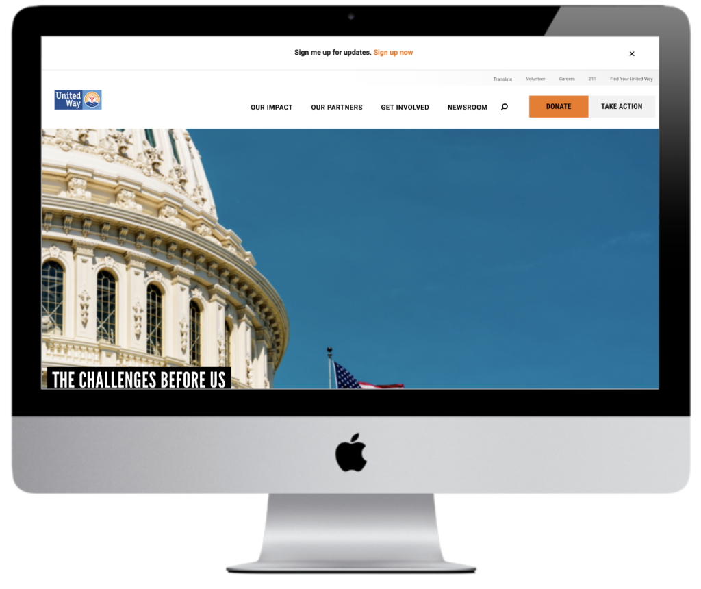
Right away you can see that their font is legible and easy to read. This makes it easier for folks with vision impairments and learning disabilities to digest their content. They also have a good amount of white space, meaning there’s not a lot of visual clutter. This is really important, because too many things on a page can make it hard to process what you’re offering.
You don’t want folks to miss out on all of your great content! So start by making small changes today. Next time you post a video, make sure to use captions. And if you’re sharing a photo, type up a description to go along with it. It’ll take some time to get used to, but it’s definitely worth it to know that your content will be accessible to more people!
The list of things you can do to make your homepage more inclusive goes on and on. Making your business inclusive is a step-by-step journey. It’s going to take time! But you can start by making changes to the language you use, the photos you pick, and the accessibility you create! Because at the end of the day, you want your audience to connect with you. And to make sure that happens, you need to make them feel seen by you.
(Originally published on 1/19/2021 on rhodesiajdesigns.com)

